Validation and interpretation#
Validation in risk screening follows three complementary steps:
Input validation: checking that raw data — hazard, exposure, and vulnerability — are correctly formatted, geographically coherent, and appropriate for the analytical context.
Output interpretation: verifying that model results are physically plausible, spatially coherent, and consistent with observed disaster records.
Uncertainty quantification: characterising and communicating the confidence associated with the estimates, so results are not mistaken for precise predictions.
These are not sequential one-off checks but an iterative cycle: findings at each step should feed back into the others.
Validate input#
It is always a good practice to spend some time to evaluate the quality and representativeness of input data before diving into the analytics. Input data can contain errors and artefacts; sometimes they are large and evident, sometimes they are small and hard to catch — but that doesn’t mean they don’t have an impact on the quality of results!
Hazard#
Correct values interpretation and outliers#
Check layer projection system (CRS) and resolution
The CRS should be the same for all layers involved in the analysis, e.g.
WGS 84 - EPSG: 4326
Check unit of measure (hazard metadata)
Is the unit of measure the same as expected by the vulnerability model? E.g. flood depth could be expressed in centimeters, meters, or by classes
Check values distribution (histogram)
Is the range represented compatible with the unit of measure? Are there outliers?
Set a proper cut for outliers
Set up appropriate classification and symbology (legend)
This could be quantitative or categorical depending on the data
Geographic correlation#
This is easier to check for hazards with strong dependency to the geomorphology, such as floods and landslides. An inspection of hazard layers against a reliable basemap (e.g. ESRI or Google) can help to spot inconsistencies between the representation of hazard distribution and its expected behaviour (rule of thumb) in relation to the basemap.
Some examples:
River flood extent occurring too far from its catchment; depth values not matching with the elevation from digital terrain model.
High landslide hazard on flat terrain.
Coastal floods spreading inland for kilometers on coastal plains.
Comparison against empirical datasets#
Probabilistic scenarios of hazard data can be compared with observed disaster events to corroborate the analysis, although this is often a difficult task due to lack of granular spatial data representing the events. Some hazards are better covered by observations than others - see the disaster records.
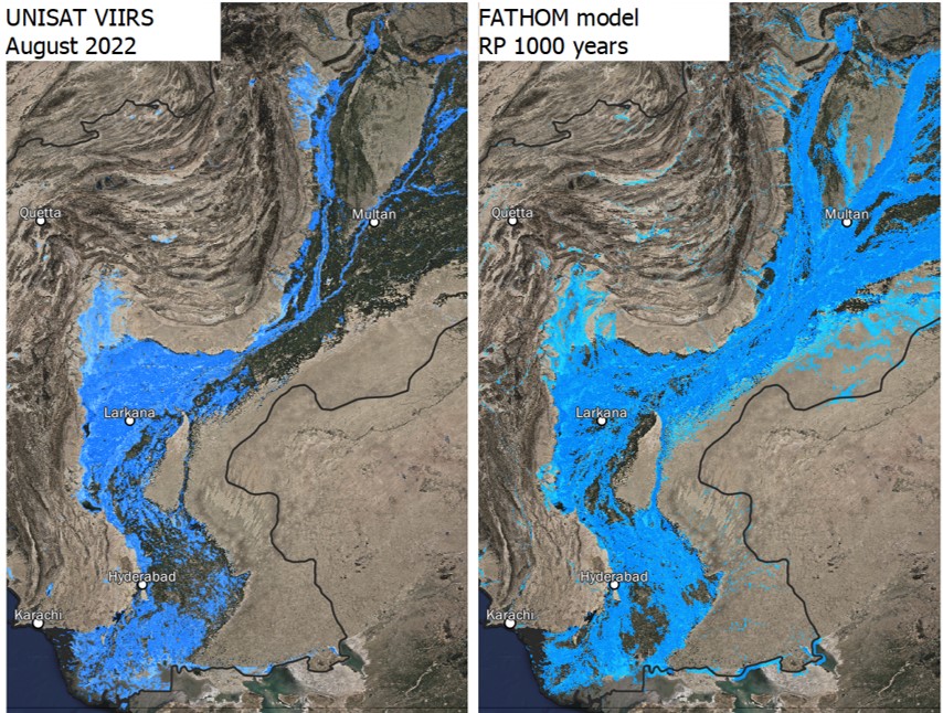
Fig. 36 Example of flood model extent validation between observed events (UNOSAT, Pakistan 2022) and probabilistic model (Fathom RP 1,000 years).#
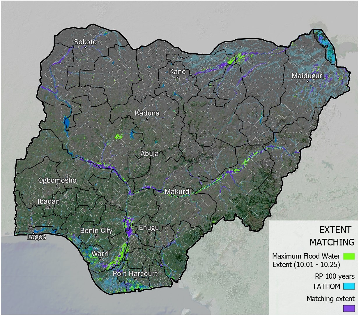
Fig. 37 Example of flood model extent validation between observed events (UNOSAT, Nigeria 2022) and probabilistic model (Fathom RP 100 years).#
Cross-comparison between alternative datasets#
Run a spatial and numerical comparison between models to estimate their similarity.
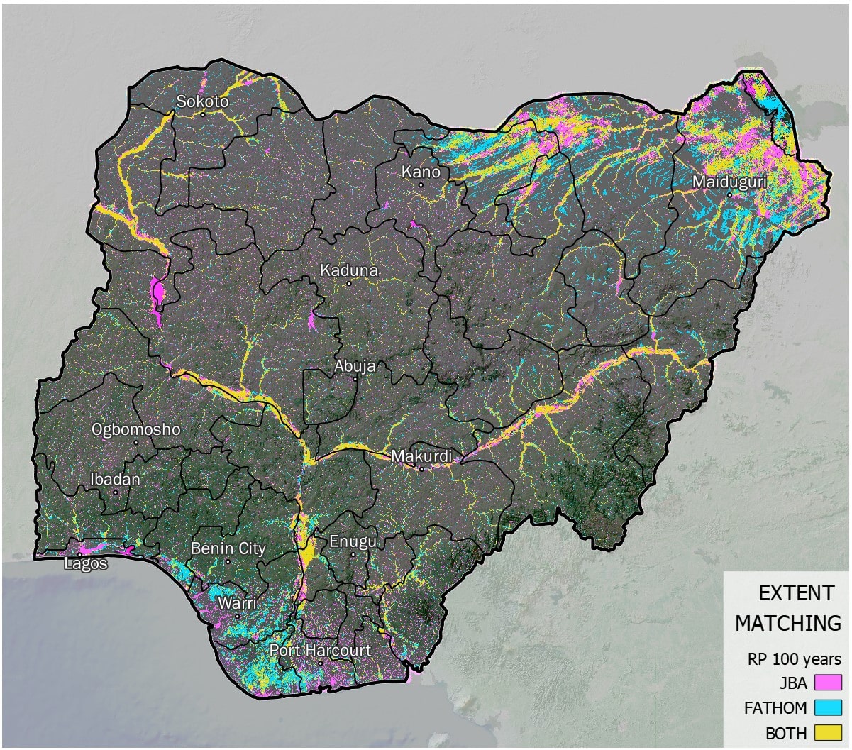
Fig. 38 Example of map showing cross-comparison between two different models representing probabilistic flood hazard extent over Nigeria (RP 100 years).#
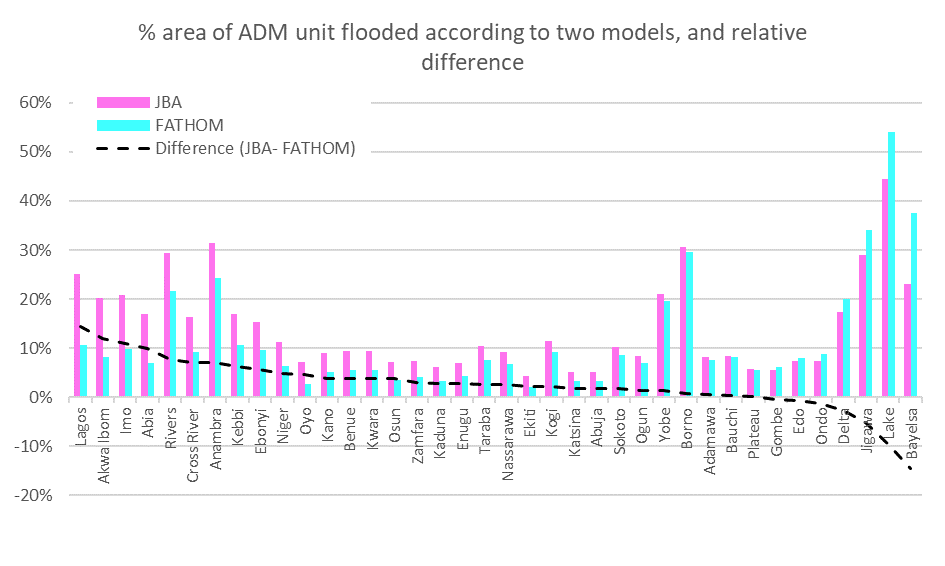
Fig. 39 Example of chart showing cross-comparison between two different models representing probabilistic flood hazard extent over Nigeria (RP 100 years): share of affected sub-national area according to each model, and difference between the two models.#
Exposure#
Correct values interpretation and outliers#
Check layer projection system (CRS) and resolution
The CRS should be the same for all layers involved in the analysis, e.g.
WGS 84 - EPSG: 4326
Check the exposure category and unit of measure (exposure metadata)
Is the unit of measure the same as expected by the vulnerability model? E.g. population could be expressed as count, density, percentage. Land cover values could be binary or categorical
Check values distribution (histogram)
Is the range represented compatible with the unit of measure? Are there outliers?
Set a proper cut for outliers
Set up appropriate classification and symbology (legend)
This could be quantitative or categorical depending on the data
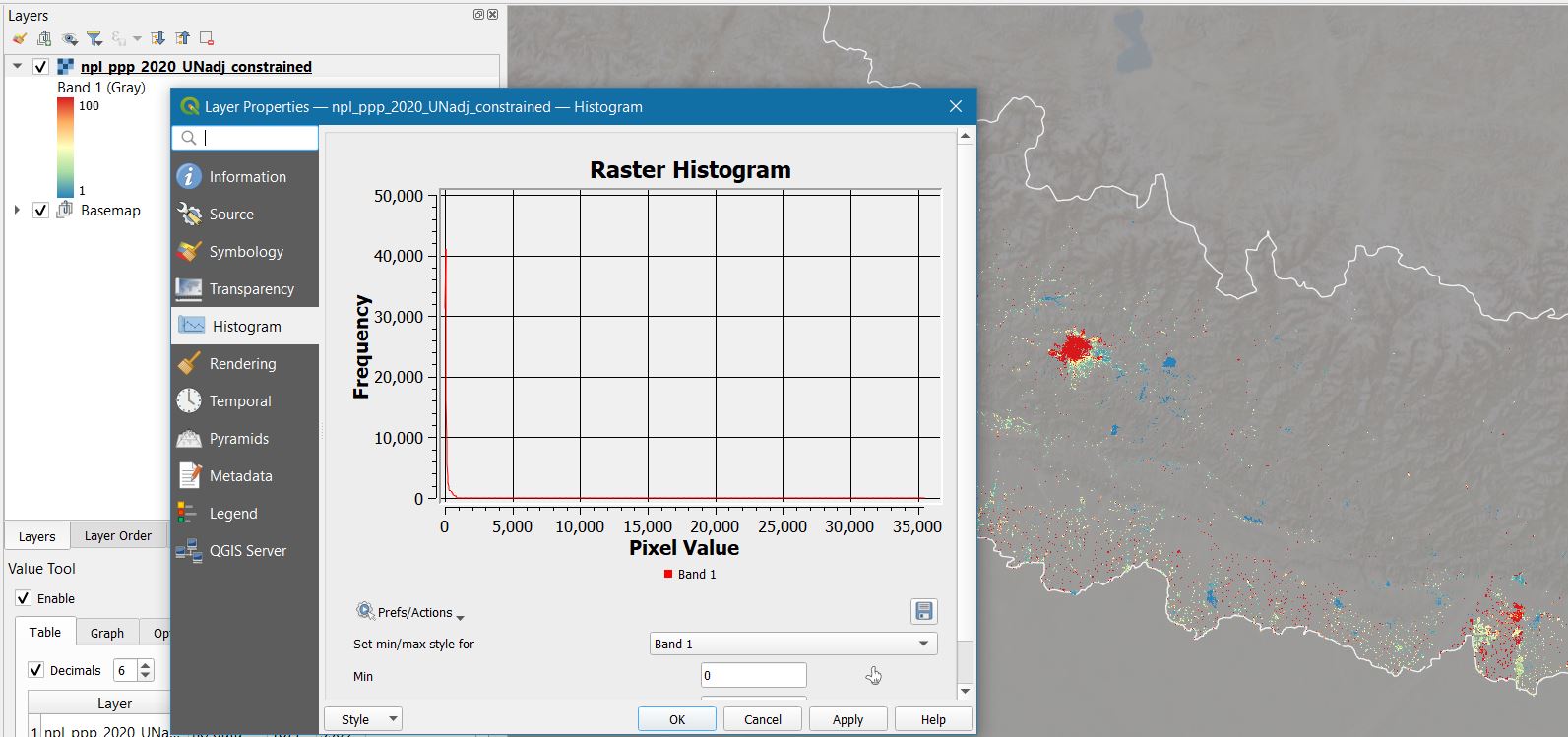
Fig. 40 In this example, we are examining the WorldPop 2020 population layer for Nepal (UN-adjusted, constrained to built-up). The resolution is 100 x 100 meters = 1 Ha; initially, we set the max legend to spectral (blue-yellow-red) and the threshold to 100, to better spot high-density areas (red). Then we take a look at the histogram, and we notice that the population values go up to 35,000, equal to 3.5 per square meter. That seems reasonable only for very-high density areas with tall buildings (meaning that the people can distribute vertically over the same cell). While those value seems unrealistic elsewhere.#
Comparison against basemap#
Identify artifacts in exposure data by sample inspection; if the errors are limited and a better source of truth is available for comparison, fix them manually; else, account for them in the results interpretation and uncertainty.
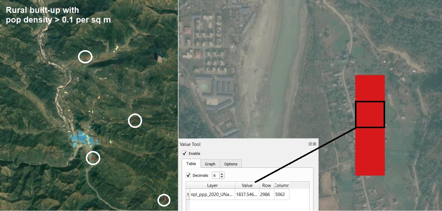
Fig. 41 Following on the previous example over Nepal; let’s change the legend max to 1,000 and take a closer look to high-density pixel (> 0.1 people per square meter). Let’s go sampling now, select any high density area located outside large city areas. Then zoom in, and compare the value of the pixel with the size and type of built-up according to recent google basemap. In the higlighted case, it seems very unlikely that >1,800 people live in that hectar of rural built-up. We also notice how other built-up area are not captured by the data; we can conclude that the model erroneously project population from the whole census area into a small portion of the real built-up. This would not have an important effect on more uniformely-distributed hazards (e.g. heat, air pollution), but it can introduce huge errors in risk calculations for localised hazards such as floods and landslides.#
Cross-comparison between alternative models#
Run a spatial and numerical comparison between models to estimate their similarity.
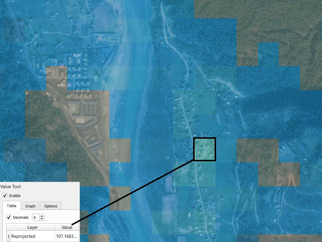
Fig. 42 Following on the previous example over Nepal; we now load the GHS-pop 2020 layer and attribute the same projection and legend used for the WorldPop layer (and set the rendering to “overlay” for better visualization). We notice that the values are much more realistic in this case; on the counterside, low population values are distributed also in areas where no settlement is found. This can also introduce error in risk models, depending on the hazard. For this country, neither of the two population datasets examined is flawless and can’t be manually fixed. This must be accounted in the interpretation of results and discussion of uncertainty.#
Vulnerability#
Impact function applicability#
The vulnerability component is often the least scrutinised at input stage, yet it can be the largest source of structural uncertainty in the final results.
Confirm that an impact or fragility function exists for the specific combination of hazard type and exposure category being analysed (see the supported combinations).
Review the source and geographic context of the function. Functions calibrated on European or North American building stock may not transfer well to informal settlements in low- and middle-income countries. Where possible, prefer functions derived from similar climate and construction contexts.
Where multiple functions are available for the same hazard-exposure pair, run the analysis with each and compare EAI/EAE results. Large divergence between functions indicates high structural uncertainty that should be reported alongside the results.
Class-based approaches (EAE)#
When using hazard exposure classes rather than a damage function, verify that the intensity thresholds defining the classes are physically meaningful for the local context. For example:
Flood depth thresholds appropriate for reinforced concrete structures (e.g. 50 / 100 / 150 cm) may be too coarse for earthen or bamboo construction where damage starts at much lower depths.
Heat index classes should be calibrated to local acclimatisation baselines, not temperate-region norms.
Sensitivity of EAE results to threshold choice should be tested and documented.
Output interpretation#
The analytical model produces numbers; it then falls to the ability of the risk analyst to interpret them correctly, spot errors, and build a narrative to make the results digestible for a non-expert audience.
Sanity checks#
Before any deeper validation, run basic checks on the raw output values:
Units and magnitude: EAI values expressed as mortality counts or built-up area damaged should be plausible relative to the total exposed population or asset stock. Relative impacts (EAI as a share of total exposure) above 10–15% for a single return period warrant investigation.
Physical bounds: relative impact values above 100% always indicate a technical error — typically a unit-of-measure mismatch or CRS inconsistency.
Monotonicity: impact should increase with return period severity. If RP100 impact exceeds RP1000 impact for the same hazard type, check the input hazard layers for that scenario pair.
Zero or near-zero results: a result of exactly zero EAI where hazard and exposure both exist is a red flag — check that the hazard and exposure layers spatially overlap in the same CRS.
Spatial pattern review#
Check that the geographic distribution of risk results is physically coherent before comparing against any external benchmark:
High-risk administrative units should correspond to areas with both high hazard intensity and significant exposure density. Units that are high-risk despite low hazard (or vice versa) should be investigated.
Risk should concentrate in expected locations: floodplains for river floods, low-lying coasts for coastal flood, steep terrain for landslides, cyclone tracks for wind. Anomalies relative to these expectations may indicate model artefacts or data errors.
Implausibly uniform EAI distributions across large administrative units often reflect aggregation errors or mismatch between the hazard resolution and the administrative boundary level used for zonal statistics.
Sensitivity analysis#
Risk results can be sensitive to key modelling choices. A structured sensitivity check should cover:
Hazard dataset choice: if an alternative global or local hazard layer is available, re-run the analysis and compare EAI/EAE at the sub-national level. The CCDR tools support custom hazard inputs for this purpose.
Vulnerability function choice: where multiple fragility or impact functions exist for the same hazard-exposure pair, compare results across functions.
Hazard threshold (EAE): for class-based approaches, vary the intensity thresholds and record how much the EAE changes.
Large sensitivity to any of these choices constitutes structural uncertainty and must be flagged in the results narrative. It also indicates where investment in better local data or function calibration would most improve confidence.
Validation against empirical disaster data#
Does the calculated distribution of risk reflect the historical distribution of disaster events as recorded by catalogues (e.g. EM-DAT) and agencies (e.g. ReliefWeb)?
If not, can you explain the reason? Common explanations include: incomplete disaster records, a historically unprecedented exposure growth in recent decades, or a hazard model calibrated on a longer return period range than what historical records can document.
The EAI mortality estimate for a country can be compared against the EM-DAT long-term annual average deaths as a rough order-of-magnitude check. Expect the model estimate to be higher than historical averages, as EM-DAT captures only recorded events within a finite observation window.
Comparison against published benchmarks#
Several global risk platforms provide independent estimates useful as a cross-check:
Platform |
What it provides |
|---|---|
Qualitative hazard level by administrative unit |
|
Probabilistic hazard and infrastructure risk layers |
|
Global risk estimates by hazard and country |
|
Historical annual average deaths and economic losses |
A significant discrepancy with any benchmark does not necessarily indicate an error — different models, hazard datasets, and exposure definitions will produce different numbers. But discrepancies should prompt investigation and be explained in the analysis narrative.
Uncertainty#
In the development of risk models, many different data sets are used as input components. The level of uncertainty is directly linked to the quality of the input data. In addition, there is also random uncertainty that cannot be reduced. On many occasions during model development, expert judgment and proxies are used in the absence of historical data, and the results are very sensitive to most of these assumptions and variations in input data. As such, outputs of these models should be considered indicators of the order of magnitude of the risks, not as exact values. Better data quality and advances in science and modelling methodologies reduce the level of uncertainty, but it is crucial to interpret the results of any risk assessment against the backdrop of unavoidable uncertainty.
A risk model can produce a very precise result—it may show, for example, that a 1-in-100-year flood will affect 388,123 people—but in reality the accuracy of the model and input data may provide only an order of magnitude estimate. Similarly, sharply delineated flood zones on a hazard map do not adequately reflect the uncertainty associated with the estimate and could lead to decisions such as locating critical facilities just outside the flood line, where the actual risk is the same as if the facility was located inside the flood zone.
We should not be apprehensive of using information that is uncertain so long as any decisions and actions based upon the information are made with a full understanding of the associated uncertainty and its implications. It should be remembered that uncertainty will usually promote an analytical debate that should lead to robust decisions, which is a positive manifestation of uncertainty. Credible scientific results should always be presented together with their associated uncertainty.
Communicating uncertainty to stakeholders#
When presenting results to decision-makers and non-expert audiences, the way uncertainty is framed matters as much as the estimates themselves:
Avoid false precision. An EAI of 1,247 people per year implies a level of accuracy the model does not have. Express results at a meaningful level of precision (e.g. “approximately 1,000–1,500 people per year”) or focus on relative comparisons between administrative units rather than absolute values.
Use directional language. “Area X faces significantly higher risk than area Y” is a more defensible statement than quoting a specific number when model confidence is limited.
Calibrate confidence language to the evidence. Use “high confidence” when multiple independent datasets agree; “indicative estimate” or “order-of-magnitude” when relying on a single global model without local validation data.
Be explicit about what is not included. CCDR tools estimate direct impacts from a defined set of hazards. Indirect losses, cascading effects, and hazards not covered by the current dataset are outside the scope. Stating this clearly prevents results from being over-interpreted.
Flag where better data would help. Identifying the specific data gaps that limit confidence (e.g. absence of a locally calibrated fragility function, or lack of high-resolution hazard data) helps stakeholders understand the value of investing in improved data and more detailed assessments.
See also
The IPCC AR6 guidance on communicating uncertainty provides a structured vocabulary (likelihood, confidence level, agreement) that can be adapted for risk screening results.