Results presentation#
Maps#
The best way to depict spatial variability is through maps. For baseline risk mapping, there is no simple automation; QGIS is used to import the data and print into maps.
The geopackage and tiff data produced by the tool can be simply dragged within QGIS main window to import them in the Table of Contents (ToC).
You can add a basemap for reference. The best way is using the Quick Map Service plugin.
A proper symbology should be applied to each layer.
The print layout window is used to build the map to export as a picture, adding legends, scale bar, etc.
See also
Do you prefer to map using python? Take a Python data-viz free course!
Figures#
Charts allow to give a quick snapshots of key output, e.g. the most risk-prone units in a country.
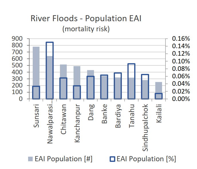
Fig. 43 Example of chart depicting absolute and relative EAI.#
Charts are also better than maps to display the difference between baseline and future risk.
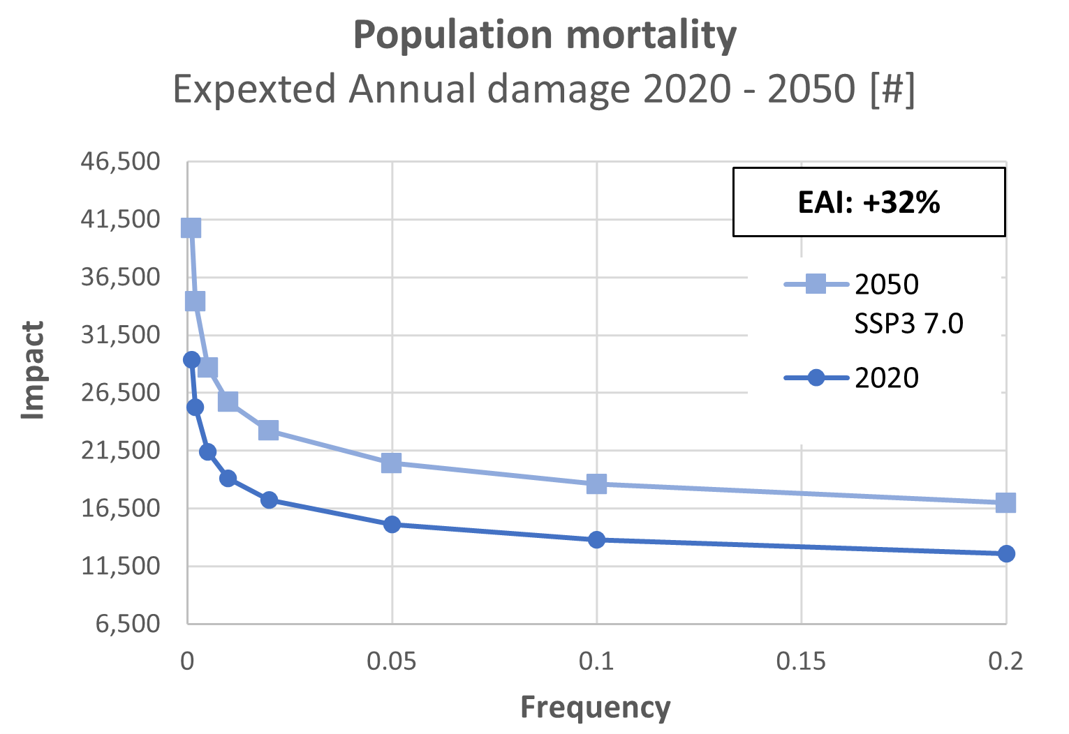
Fig. 44 Example of chart depicting absolute EAI for historical baseline and future projection scenario.#
Dashboard#
An open-source online dashboard has been developed in order to quickly disseminate results of risk screening and assessment.
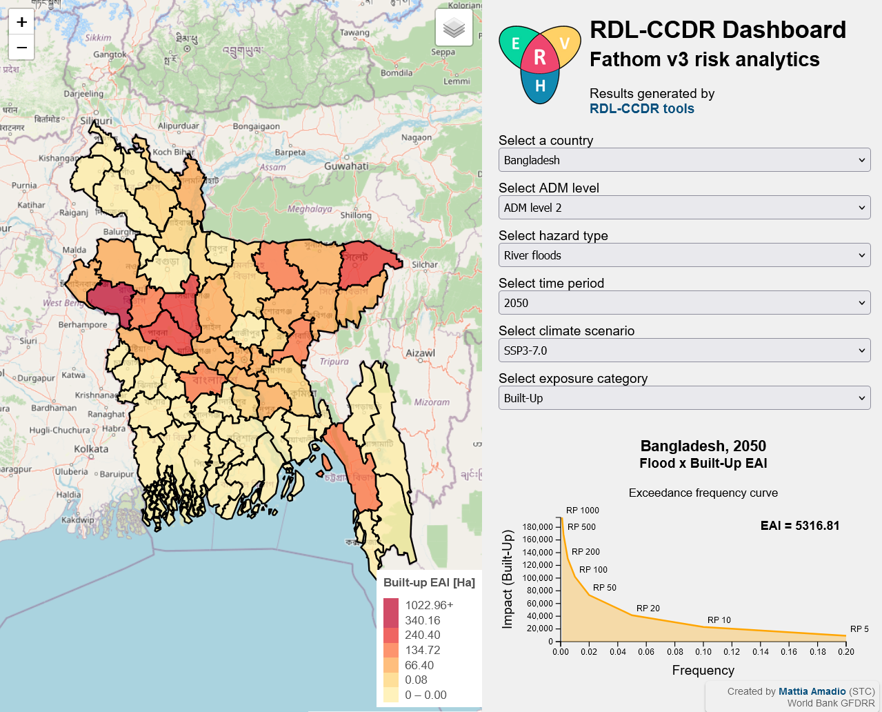
Fig. 45 Geo-dashboard for dissemination of risk screening results.#