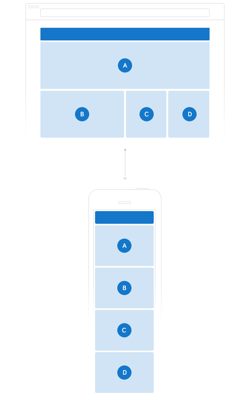
To ensure a great user experience regardless of screen size or technology used, we have used a responsive template.
This means content blocks will resize and reorder depending on the screen size for optimal display. Content will be arranged from a more flexible grid structure on larger screens to a straight vertical list of blocks that users can scroll downwards through.